

The series of photos below tell a story about how buyers in the Greenville area bring high fashion to their boutiques and integrate Greenville’s conservative tastes.


Business Card
Shown above is the front of my business card which includes my name, subject of business, my school, and my contact information. If we’re being honest it took me a while trying to figure out all of the features on Photoshop because I hadn’t played with it for quite some time. However, once I got the hang of it I spent hours playing around with different images and features inside the application.
To start, I found two images on the internet that were copyright free and I played around with them a bit. I chose lipstick lips and a mascara wand with the black ink running because if I were to ever start my own business at this juncture I would have my own makeup company. Sadly, it is just a dream but I had a lot of fun playing around with a potential business card for my dream makeup company (makeup enthusiast).
Anyways, the break down of what I did is as follows:
First, I created a new layer above the background because I didn’t want to make any permanent changes on top of the background layer. Next, I chose a peach, flesh tone color that I thought was a pretty neutral for the pictures and text I would layer on top. Next, I inserted the picture of the mascara wand by dragging and dropping on an entirely new layer and selected “place” photo. I used the quick selection tool with the (+) to select all of the pieces of the background inside the mascara brush picture to get rid of the white background after clicking “add layer mask” at the bottom. There were still some background pieces within the black ink of the mascara so I used the magic wand tool to quickly select those and delete them. Whew! That took a while to figure out (probably the bulk of my brain power).
After that I wanted the mascara wand and its color to have a metallic sheen to it so I searched around in the effects and gave the image a gradient metallic-y gray and was really excited about what I saw. The image literally took on a silver sheen and I loved it!
Next, I wanted to add text, and there are only two different types that I used. For my name, I chose “Lucida Handwriting” in pt. 18 font. I wanted the color to match the lips picture I was going to put on the back of the card so I tried to eyeball it and match the color. I know there’s an actual tool I could have used for that but it was a little complicated for me to try to figure out at the time. Next I added the make-up enthusiast, Furman University, my e-mail and cell all in separate layers with the font “Orater Std” in font size 8. I loved the outcome so I was pretty excited about the overall look.
After, I went back and decided to add a shadow to my name in the same color red with the fx tool on the side by right clicking the layer and going from there.
Finally, I placed the picture of the lips and went through the same process that I did with the mascara wand. I removed the background with the quick selection tool and clicking add masking layer. Then, I removed the middle background color from the lips using the magic wand tool and using the delete button from there.
My final step was to link all of the layers together and use the Layer > Flatten Image option and flattened all of the images together. It came out to be two different tabs with the back of my business card and the front. I was really happy with the turn out!

The Real & The Ideal
“Pictures tell a thousand words” could not be more accurate for Kress and VanLeeuwen’s chapter entitled “Meaning of Composition.” They discuss the various characteristics that make up a photo, including what makes an element the centralized focus and what does not. Commonly your eyes focus on a salient element in photographs (or just about any work of art) that is meant to draw your attention.
Three principles of composition:
- Information Value: various elements are attached with specific informational values for the various “zones” à top and bottom, left and right, center and margin
- Salience: the elements are made to attract the viewers’ attention to different areas such as placement in the foreground and background, relative size, contrasts in tonal value, differences in sharpness, etc.
- Framing: the presence of absence of framing devices connects or disconnects elements of the image, determining whether they belong together or do not belong together
The Dior Ad Campaign, shown above, incorporates all elements described thus far. In the ad, the light coming from the higher “heavenly” dimension pulls the salient Marion Cotillard, who is “connected” (framing) with the Dior handbag, into the light while the man attempts to pull her into the darkness (the disconnected character). The focus remains on the two characters clothed in dark garments due to the pale city scene in the background. Ultimately, the man fades into the distance as if to say that Dior’s purses dominate over the importance of any man (which I mean, duh).
Another way of looking at photographs is the way the images position themselves in the photos. The image left of center portrays a man who wants his woman to follow him into reality (his body leans toward the city), which is the “Given” portion of the image. Historically, men present a sense of dominance and guide their women (and yes I mean that like possession) towards their own selfish desires (or at least this used to be the archetypal man). The image at the right of center presents the “New” portion of the image. Marion is turned away from the man and follows the light coming from the upper right hand quadrant, or the heavenly portion of the ad. The choice she makes of the handbag, while neglecting him, is a new age idea that shows independence, strength, and the courage to be alone.
The “Ideal” concept also comes into play, where Marion chooses the present ideal of independence (and a handbag) over the old stigma of having the security of a man. His face and body begin to fall into darkness while the light of the upper right corner pulls Marion further away. Dior depicts a progressive ad here, where a woman appears to choose her own desires over those of a man.
Source of image: http://www.fashionadexplorer.com/l-dior–c-ad-campaign
Imagery: The Hidden Meaning
Just like we use words to describe the world around us, we use images to depict our perspective without utilizing words. Paintings, sculptures, photography and so on all are created with different messages in mind. For the purpose of explaining imagery, let me hone in specifically on photography.
Photography, specifically, is seen by some to be an objective truth of events. The raw realism in the photos depicts one moment in time that can simultaneously be informative and expressive. In fact, multiple images paired together depict a journey through time with a larger message in mind. For instance, National Geographic might post a series of photos showing how the polar ice caps in Antarctica have shifted and melted over time. The powerful imagery and raw realism of the photos creates a mental picture of the devastation that is to come in the future if we do not act now.
Rowe’s article discussing sports photography describes the human body in the images to be sexualized, genderized, radicalized and so on. Sports images, furthermore, come in several varieties. In some images, bodies are “gendered” meaning men are seen as rugged, independent men and passive, dependent women. In other photos, like pornography for instance, women are “sexualized” for the sole reason of creating excitement. This idea parallels the idea of sports photography, which itself is taken for the excitement of the viewer (in a different context!).
In images (photography too) there is a relationship between the signifier (image/sound/word) and the signified (meaning) as first described by Saussure. In sports photography the signifier might be the swimsuit issue of Sports Illustrated and the signifier would be sexuality (how could a woman in a barely-there swimsuit not be?). In this specific example, the object in the photo has become gendered in a form of strategic advertising. As the saying goes, “sex sells” and without a doubt there are men buying that swimsuit issue specifically for the woman on the cover. The woman is essentially a symbol for sexuality, beauty and health and each of those things is clearly depicted with her toned, scantily clad body.
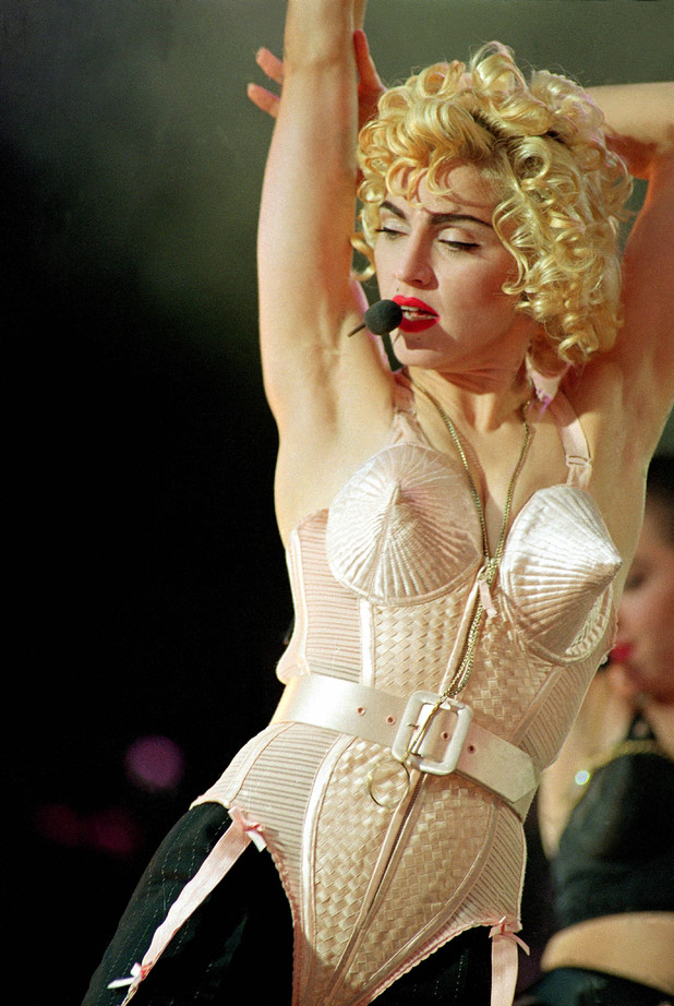
Additionally, images themselves can be considered iconic, even the people in them. For instance, the iconography of the mother and child represents the universal concept of maternal devotion. In other contexts, specific people are seen as iconic. Specifically, Marilyn Monroe who was seen as a sex icon with her blonde hair and womanly curves. Madonna, the iconic singer, combined the religious iconography of Madonna (the archetypal mother figure) and the sexual iconography of Marilyn that ultimately established her as a famous icon through the irony of the combined iconographies…say that 5 times fast.
Questions to ponder:
- Will we ever see the day when women are depicted as strong and independent rather than passive and submissive, especially in sports photography?
- What does it take to establish yourself as iconic or create your own brand of icon?
Source of image: http://www.digitalspy.com/music/i398807-8/madonna-career-in-pictures-blond-ambition-tour.html#~oLz3ROFHy7YkgF

Why Typography Matters
Typography is an ancient art that dates back to the olden days when people first began writing down their stories. Today, tech savvy people have learned to digitize type and create more than just words. Now, the type can convey the meaning behind the words instead of just being a means of communicating through text. No matter the font chosen, the message should be clear, simple and easy to read without interference from the specific font you have chosen. If a reader can’t even read what you are trying to say because the font is too over-the-top, then guaranteed they won’t even attempt to explore your blog page much less read your post.
Typography provides bloggers everywhere the opportunity to make their page unique. However, the type should be clean, readable, and accessible just like the rest of their page (hopefully!). Although it is probably better to stay consistent with one typeface, combining typefaces can also generate more interest in a blog so the page is not so monotonous. However, it is important to mix obviously different typefaces than sticking to similar ones. You definitely don’t want to give your reader a headache!
Typography establishes a brand’s essence by creating a unique identity that leaves the reader with a certain impression of what you are about. Logos and logotypes, according to Goodman, “either abstract, iconize or combine visual elements to create an ideal, memorable and fast-reading graphic representation.” A logo ideally gives the reader a positive first impression of your blog or website. Remember: the simpler, the better. An image or icon should be simple, memorable and distinct in order to represent the brand in a meaningful way.
When creating the actual logo:
- Use Ligatures: weave letterforms together to create a sense of unity
- Incorporate Calligraphy: handwritten type offers a unique form of creativity
- Merge Letterforms W/ An Icon: the interwoven icon and lettering creates a memorable brand form
As soon as a reader or potential follower enters your page, you are being judged on not only your content, but also your presentation and the uniqueness of your page. A logo immediately sets you apart from the rest and gives you a sense of identity that defines your tone and message. For example, Nike’s symbol, the “swoosh”, is iconic. Nike, known as the winged goddess of victory, uses its symbol to convey the swiftness, agility and superiority of the consumers who buy and use its products. People who wear Nike are essentially wearing the garments of a victorious goddess. Isn’t that majestic?
Questions to ponder:
- So much of typography is digitized in this day in age; will the classic forms ever make a comeback?
- What happens when a corporation’s or even a person’s iconic logo becomes a denotation of bad quality or dishonesty?
Source of image: http://designspiration.net/image/1083996484621/
Seriously, Don’t Be A Sell-Out
One of the hardest things to do these days is to establish credibility among your readers. According to Rettburg in his chapters on “Blogging Brands” and “Blogs, Communities, and Networks,” building a follower base whether you are a corporate blog or a blogger who is using advertising to make money, it is important to come off as credible and trustworthy. But how do you do that? How do you establish yourself as credible and trustworthy?
Here are a few of my observations:
First off, a lot of big companies don’t do it right. Ever seen your favorite superstore try its hand at a blog post? It almost seems like a giant, forced advertisement that you exit in about 30 seconds. There are ads all over the place constantly trying to goad you into buying a product that will “make your summer great!” It simply seems like a lot of big name brands’ blogs are just a waste of time. So what do successful blog pages look like?
Well, successful pages have very few advertisements, if any. The blogger typically has content that is intriguing, highly useful and entertaining. Great visuals are also essential to helping your blog be successful. Tutorials or how-tos for things your target audience cares about can work well to build a readership base and keep your brand at the top of your readers’ minds.
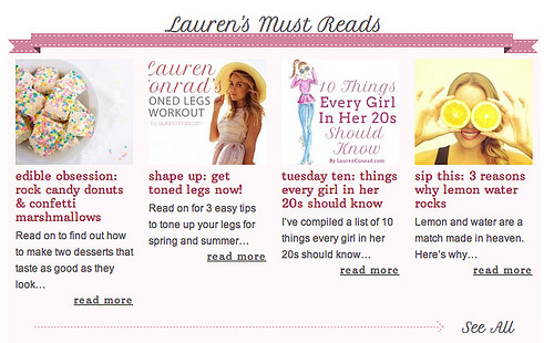
For instance, I once stumbled across a Lauren Conrad blog post on juice cleanses. I wasn’t sold on the idea initially, but once my roommate started talking about doing one together, I immediately remembered Lauren Conrad’s post and read my roommate tips on how to do one.
The blog post took on an authentic tone, citing each step of her journey with no plugs for specific juices. Before I knew it, I was a regular visitor of her blog because she not only won over my interest with her perspicacity for health, but beauty, fitness and style. After a while I began looking through her posts and without realizing it, I was already considering buying her products because I felt her tone was always so genuine.
So what’s the most important thing to remember about blogging? Keep an authentic tone. If you are trying to sell something to your followers they will recognize it! Do not assume people are idiots. In order to be considered credible – and yes it may take time but don’t give up – you need to develop an authentic tone. If your readers develop trust in both your writing and your blog, you will even develop a network that will surprise you.
Questions to ponder:
1. If a blogger you trust does start using advertisements, would you still consider him or her credible if they were to make it clear they are not being paid to post?
2. How can we as readers ever trust corporate blogs, especially when they write about one of their products – isn’t it just to get consumers to buy it?
Source of image: http://laurenconrad.com/

Journalism vs. Blogs, The Battle of Credibility
Blogs typically intersect with journalism in three general ways according to Rettburg in his chapter called “Citizen Journalists”. First, blogs can give first-hand reports from ongoing events such as wars and crimes. Second, bloggers have the ability to track down information in a way that even traditional journalists don’t have time for. Third, a type of blogger has arisen, called a filterblogger, that will filter stories and news segments based on their interests in order to capture the information they want. Although bloggers these days can be considered the watchdogs of journalism, only 34% think of their blogs as a form of journalism and nearly 60% of them ‘sometimes’ attempt to verify these facts with other sources.
In the past, in the case of Apple, bloggers have been sued for not revealing sources when they found out information about certain companies (Apple in particular), but they argued that they should have the same rights as journalists. Again, bloggers serve as the watchdogs for journalists who sometimes slip up or make mistakes. These bloggers typically aren’t hired by companies or newsrooms so they have even more freedom than journalists do. Although in some cases the entirety of freedom that bloggers have allows them to simply say whatever they want without having any evidence to back it up. For that 60% that does use sources, I would consider them to be credible sources of information, however the other 40% that doesn’t I would consider to be the ramblings of people with tons of opinions and a lack of evidence.
Question: Will blogs ever be able to be considered true journalism by the eyes of the media?
“The essence of journalism is a discipline of verification,” writes Kovach and Rosenstiel in their chapter, “Journalism of Verification.” The ability to verify sources is what separates journalism from propaganda, art, and entertainment. It grounds facts into sources of information rather than ramblings of a subjective lunatic. Journalism focuses on getting what truly happened and finding the information to make the story credible. Furthermore, objectivity in the 1920s simply met using a consistent method of verifying your work, not remaining unbiased. Although today, remaining unbiased is many journalists’ struggle in order to relate the truth to the public. Where journalists struggle with this, bloggers take up the 20s way of remaining objective. Often, personal accounts and opinions cloud the posts they put up but their method of fact checking remains the same.
I talked about this is in a previous post, but bloggers need to serve as the watchdogs for the watchdog that is journalism. Bloggers have the opportunity to chase down facts and call journalists out when they spin stories and twist facts. Not only do bloggers have the opportunity, but also they have the duty to be the ones who hold these libelous journalists accountable for the misuse of their power. Bloggers who establish themselves as credible should take this opportunity and run with it. On the other hand, bloggers who have not established themselves as credible should ground more of their information in fact and continue to strive for greatness like so many people before. Society needs these bloggers to find the truth in the lies and correct so many of the wrongs by journalists.
Question: Will blogs follow the beaten path of journalists and begin to twist facts as well or will they rise to the challenge and become even more credible than true journalism?
My voice: I prefer to use a more proper form of English but at the same time I write casually.
source of image: http://www.problogger.net/archives/2007/10/24/how-to-build-a-credible-blog/
It’s All in the Unity
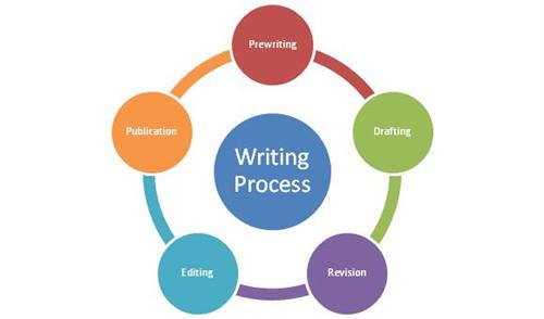
According to Zinsser in his chapter entitled “Unity”, there are several ways in which it is important to write in a unified manner. A primary way of writing with unity is to choose a tense and stick with it. Another important thing to remember when writing is choosing a mood and sticking with it as well. When writing it is important to ask yourself several questions, including: “What pronoun and tense am I going to use?” What style – personal and casual?” “What attitude am I going to take to the material – Detached? Involved?” “What point do I want to make?” All of these questions are essential to not only going your reader’s interest, but keeping it throughout your writing as well.
If you are successful in your writing, the reader will be left with one question that is thought provoking. It is important to have just one question because it means you focused in on something that not only gained the reader’s interest, but also really made him or her think. It is important to keep in mind that editing over and over again will occur throughout your writing, and this is essential to good writing and making sure all of your work is unified.
Question: How do you determine your own personal style of writing?
The lead is one of the most important aspects to any good writer’s story according to Zinsser. The lead should tug at the reader’s sleeve in a sense, tugging at his or her curiosity to find out what happens next. The lead must also provide hard details that describe why the piece was written all the while maintaining the curiosity of the reader. Each paragraph that follows the previous one should be pulling the reader deeper and deeper into the plot in order to maintain the reader’s inquisitiveness. Keeping the content casual but touched with humor on a serious subject will maintain the reader’s interest.
A great hook arises from the steady accumulation of facts that have both “pathos and faded glamour” and are ultimately in narrative form. Everyone wants to be told a story, so writing in narrative form is the best way to quench the thirst of your reader. Furthermore, it is essential to write in a voice and style that are comfortable for you, in this way the writing will be more authentic and you will more easily create a lead that will keep your readers hooked.
A great ending is also essential to any writing piece, but it should not be some boring summation of all that you have learned. Instead, it should be surprising to the reader, yet seem “exactly right.” It should give them a lift that will linger even once the piece is finished. Although the ending sentences should encapsulate the writing piece, it should be unexpected as well. Usually what works best is an ending quotation that provokes the thoughts of your reader in its finality.
Question: How long should a hook and an ending be in order to adequately attain and quench your reader’s interest?
Even in business, writing that maintains your reader’s interest is imperative to the success of your subject. Suffocating language that is full of big words and lengthy sentences will not gain the interest of your readers in any context. Essentially, it is hard for people to read flowery language that needs to be translated in order to understand. However, it is important to write with warmth and clarity. Readers ultimately identify with people, not abstract institutions. Therefore, writing in first person with active verbs will help readers identify with you and care about what you are writing.
Ultimately, it is better to avoid condensation in your writing and lengthy prose in order to better identify with those you are speaking with. Although you should not assume people are stupid, it is still important to limit the words that your reader will have to look up in a dictionary in order to understand.
Question: Where does the line lie where you are speaking with intelligence yet not being condescending?
source of image: http://lps.lexingtonma.org/Page/2264

A Defining Moment
As a Freshman in college I thought I knew exactly what I was going to major in, accounting. Since I was little my dad had always told me I was great with keeping track of the coins I would get from various chores and I would put them in a piggybank on my desk. I even recorded all of the different coins and had the total amount listed in a notebook, which I would meticulously edit any time I used the money for something. As I got older I felt I had a strong inclination for math and even decided to take a calculus course my first semester in college.
What I quickly found out was that I was not only terrible at calculus, but I hated it more than any class I’d ever taken before. None of the problems I was doing made sense to me, in a real-world context or even just the class. One day near finals I was sitting in my room close to tears because I didn’t understand a thing I learned that semester, when I realized I loathed math. I hated anything to do with number crunching, problem solving and finding “x”. That was the day I realized I no longer wanted to be an accounting major. On top of this, I realized I wasn’t trying to be a CPA for myself, but because my dad wanted me to since I had an affinity for numbers when I was a child.
I called my dad that day and told him I hated math and anything to do with it and there was no way I would ever want to be an Accountant. Not to get me wrong, accounting is great for some but it just wasn’t for me. Anyways, I was surprised to learn that my dad was supportive of whatever major I chose and it felt great to have that freedom. Finally after a long Christmas break, I decided I would be a Business major but would focus my strength on marketing courses. I had always enjoyed being around people and marketing classes almost felt natural for me while I was in them. To this day I am still happy with the major I chose and even happier it isn’t accounting.
Voice: I use a past tense with a more proper form of English. My tone is still casual but also relatable. I changed a lot of the tenses since some were in present and I chose to take out some cliches and idioms.
source of image: http://accounting.jjconline.net/
