Graphics, Website, Website Literacy

5 Strategies to Making Your Site Picture-Perfect

Did you know that users’ will spend 10 seconds or less deciding whether a web page is worthy of staying on or not? Users are extremely skeptical, and if the content is not visually stimulating or interesting you will lose them within seconds. Even if the website passes this initial 10-second judgment, you still only have about 20 seconds to retain your viewers’ interest with your content. So how do you stop viewers from leaving your website and inspire them to explore your website? Have a unique web design full of colorful, invigorating imagery to capture the readers’ interest. Out of the millions of images out there, which one should you choose?

Here are a few tips that might make choosing your image a little less daunting:

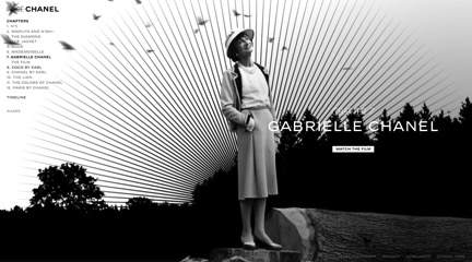
CHANEL

1. Show Instead of Tell

Instead of bombarding your users with information, use your images to creatively tell your company’s story. The brand Chanel is notorious for its rich history in Parisian fashion, founded by none other than Gabrielle ‘Coco’ Chanel. The website channels its energy towards the history of the brand through scrolling graphics and design rather than explicitly sell its products. Below details a photo of Gabrielle and on the left it is obvious that this is just one of twelve chapters detailing the history of the Chanel brand. If you were to click through each chapter or simply let the images scroll, the narrative of the company would be told through brilliant black and white imagery.

FINLANDIA2. Be Creative, Be Unique

Don’t be shy with your creativity and uniqueness. Users will be drawn to stimulating imagery and design. A wonderful example of this concept comes from Finlandia, a vodka brand native to Finland. The specialty drinks showcased envelop consumers’ senses with crisp images of ice cubes floating in a colorful, fruity paradise. Each of the graphic blocks holds a recipe that awaits conception when the consumer simply scrolls over the image. This website exudes a certain level of elegance and class that is strictly unique to their brand and executes a creative edge to entice the potential customer to delve deeper into their site.

GODIVA3. Brand Relevance

The imagery chosen for your site should be relevant to your actual brand. Any content put onto the site should relate directly back to the purpose of the company. Godiva does a great job of integrating its brand’s identity as being Belgian chocolate connoisseurs with a stimulating visual experience. Instead of simply selling plain chocolates online, each chocolate is arranged to get the company’s consumers’ salivating and ordering the deliciously wrapped treats. Godiva’s website is an experience full of delicious recipes, beautiful seasonal chocolates, classic collections and stunning graphics with every aspect relating back to the company’s brand identity. When you think Godiva, you think chocolate and that’s how it should be.

ANTHRO4. Evoke Power

Use imagery that sparks conversation surrounding the image. Furthermore, capture beauty, emotion, romance, or some other powerful ethos that will enchant the minds of viewers and evoke their curiosity to explore the rest of the site. A retail company that does this well is Anthropologie, which constantly uses bright and colorful visuals to showcase the newest designs and trends with a storybook feel. Anthropologie headed to Rajasthan, India’s largest state, for their Spring 2015 look book and enchanted consumers with beautiful palaces and fields of flowers. Anthropologie’s indie clothing may not be for everyone, but it’s hard to deny the appeal of the clothing in these photos.

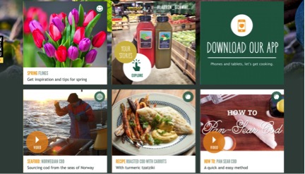
WHOLEFOODS5. Call to Action

Ultimately, producing an image that prompts followers to take action is what takes a regular image from simly improving the web design to providing visual content marketing for your site. Whole Foods dedicates its site to an assortment of calls to action from exploring the company’s blog to viewing various videos demonstrating cooking techniques. The vibrant colors and mouthwatering foods in each block entice consumers to watch the videos and read the blog posts for savory cooking tips, ultimately pushing customers to the store to buy Whole Foods’ delectable selection of groceries.

Images serve to enhance the web design of your site as well as aid in visual content marketing by giving viewers imaginative imagery that excites and stimulates their senses. If you follow these five steps of showing not telling, being creative and unique, ensuring brand relevance, evoking power and finally, having a call to action, then you will most definitely retain the interest of your website viewer for more than 10 seconds. For additional information on the topics of web design or imagery, check out articles by Mahnoor Mirza or Anthony Gaenzle for wonderful advice and profound insight.

Standard
Website Literacy

The User Experience: Navigating Through the Clutter

A user-friendly experience on any website or blog begins with the functionality and coherence of the entire page. If you look at the page and everything just “makes sense” then you are probably going to have a great user experience. Essentially, the more simple yet creative a page, the better the experience. I mean, no one wants to enter a page, only to reason it will take 10 clicks to get to your target.

Take Zara’s page for instance, the entire site exudes a kind of stark simplicity. The title of the website is top center, the left side has all of the links and the middle of the page features a slideshow of the updated items on the site. If you click on one of the buttons, for instance “Woman,” you are greeted with several different options from there to pick. From “Coats” to “Accessories,” you have the option of clicking several categories for your shopping pleasure. If you click “Coats” you are immediately taken to the coats page where you can finally pick out and purchase that leopard fur coat you’ve had your eye on.

Zara focuses mainly on their products, so the user experience is a good one. You don’t have to sift through articles and blog posts about their newest products or see endless explanations about how something can be worn. Zara is essentially simple and to the point with no fuss on anything but its products. Furthermore, if you’ve ever been in a Zara store, you realize that the site is a reflection of the stark simplicity of the inside of its actual store. The parallel there is fantastic since it actually embodies the character of the brand.

If you take note from Zara, you will quickly realize the following: 

  • Design with your user in mind
  • Keep it simple
  • Make it so easy to navigate your dog can do it
  • Keep it consistent
  • Be a minimalist and lose the complexity 

Let’s peel away the layers of the user experience using the 5 planes discussed by Jesses James Garrett in his book, The Elements of User Experience. 

  • The Surface Plane: Series of images that perform different tasks, visual and clickable.
  • The Skeleton Plane: Placement of buttons, controls, photos and blocks of text.
  • The Structure Plane: How users got to that page and where they could go when they were finished there.
  • The Scope Plane: The way in which the various features and functions of the site fit together.
  • The Strategy Plane: Incorporates not only what the people running the site want to get out of it but what the users want to get out of the site as well.

So let me break these terms down for you with the example of Zara. First, you get to the page and you see the simple layout with self-explanatory features. This is the surface plane made up of the different images featuring new fall fashions and items new to the sale category. The skeleton plane features things like “New Arrivals,” “Woman” and so on that allow you to click on these things to get to the “Coats” and “Tops” sections in order to shop. The structure is basically how you got from the home page all the way to buying your favorite leopard fur coat and then back to shopping. The scope is how all of the pictures of the coats and various other items like the jeans are incorporated so the page is clean and not jumbled. The strategy essentially is to ensure that the site is easy enough to navigate for people to shop and buy things while having a user-friendly experience where they come back for more.

Questions to ponder:

1. Is a page ever to over-simple making it seem boring?

2. What are the worst user experiences you’ve had and what did you learn not to do?

Source of image: http://www.zara.com/us/en/woman/coats-c269183.html

Standard
Website Literacy

Do Not Reinvent the Wheel: The Dummies’ Guide to Website Literacy

When someone looks at your website you have a little less than a minute to capture the viewer’s attention. In that short time span you have to engage your viewer almost instantly and if your page isn’t up to snuff, goodbye viewer. So, what can you do to keep your viewer’s interest? Well, Krug outlines various ways starting with “don’t make your viewer think.” In fact, it is Krug’s First Law of Usability.

Your viewer should be able to “get it” – what it is and how to use it – without expending any energy, after all you have less than a minute to keep your viewer interested. For instance, icons on the front page should be labeled as “pictures”, “about me”, “contact me”, not “graphicland”, “moi”, “let’s chat”. The navigation through your site should be obvious enough that thinking is hardly required. Essentially, your main objective when creating a website should be eliminating your viewer’s question marks.

On the other hand, if you can’t make something self-evident at least make it self-explanatory (so it only requires a little mental effort). Make your page so easy to navigate it’ll make your user squeal with excitement (I don’t know if squealing will actually happen, but they’ll at least be a little pumped). The content is where you can put your originality and creativity to work, leaving your viewer wanting more. However, in the case of your page – give your viewer everything they could want and more.

So for simplicities’ sake, let me break it down for you:

  • Intuitive: like Jimmy John’s, the site should be so navigable the viewer will freak
  • Scannable: the content should be broken up so the viewer can scan the page and pick up the gist of what you are saying in a matter of seconds
  1. Use of conventions: essentially graphics that are universal and let your user click on the image without a sliver of a doubt (i.e. the shopping cart icon leads them to the check-out)
  2. Do not reinvent the wheel: use these conventions and use them well my friends, they’re universal for a reason
  3. Visual hierarchies: write like a journalist (i.e. inverted pyramid of most important info. first, least important last)
  4. Use headings: duh.
  5. No extra noise: let your content speak for itself
  6. Highlight: if something is important, show your reader (see what I did there?)
  • Rule of Clicks: the user should only have to click to something in 3-4 clicks and it should be as painless as possible (i.e. Contact us > Advertising Department > Advertising Director > Bingo: Betty 555-5555)
  • No nonsense: get your point across in as concise a way as possible and get rid of all that fluff

I’m a shopping addict, so the Piperlime site is as intuitive as anything I could ever want. Literally, you go to the page and immediately you are greeted with gorgeous pieces that you want in your wardrobe in a clickable scrolling headline. There is a tool bar across the top, the logo is in the left corner and daily deals are mentioned at the very top. Then you click on what you want.

Like I said I have an addiction so the “What’s New” tab is my go to – I literally already have the old pieces memorized and categorized, it’s sad. At this point you now have the option of clicking several different categories and shortcuts to get where you want to go, i.e. OP Picks (Olivia Palermo and her fashion fluency, of course). Or, I mean you could just look at the entire list of new goodies right then and there (where I then add 30 new items to my shopping basket – do they have a shopaholics anonymous?)

Questions to ponder:

1. How simple is too simple?

2. Is re-creating the wheel ever useful?

Source of Image: http://piperlime.gap.com/browse/home.do

Standard